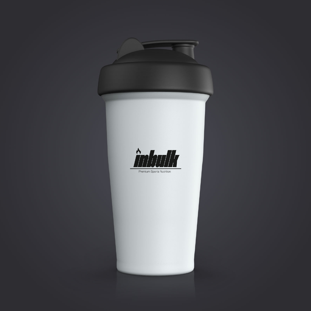
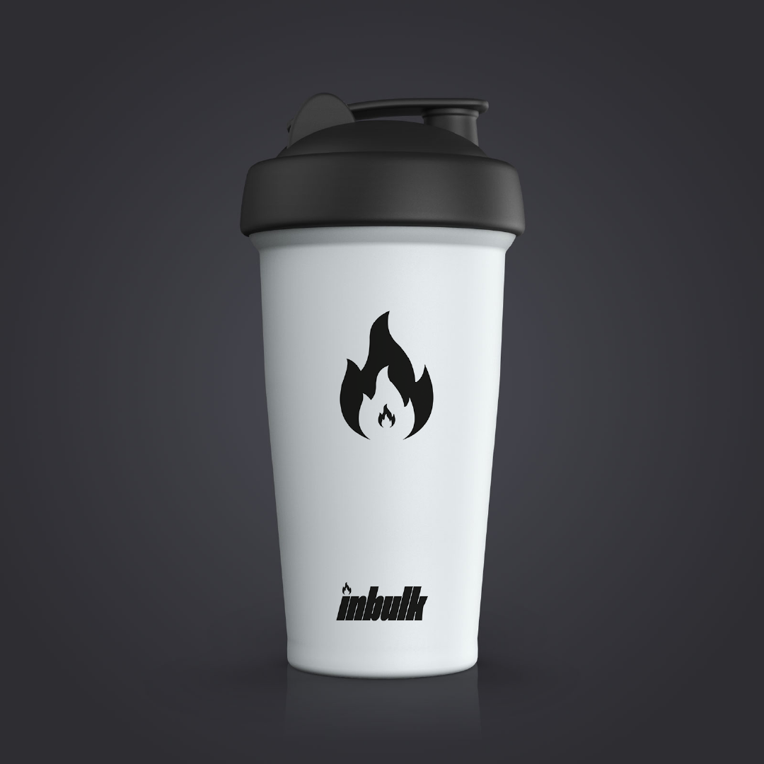
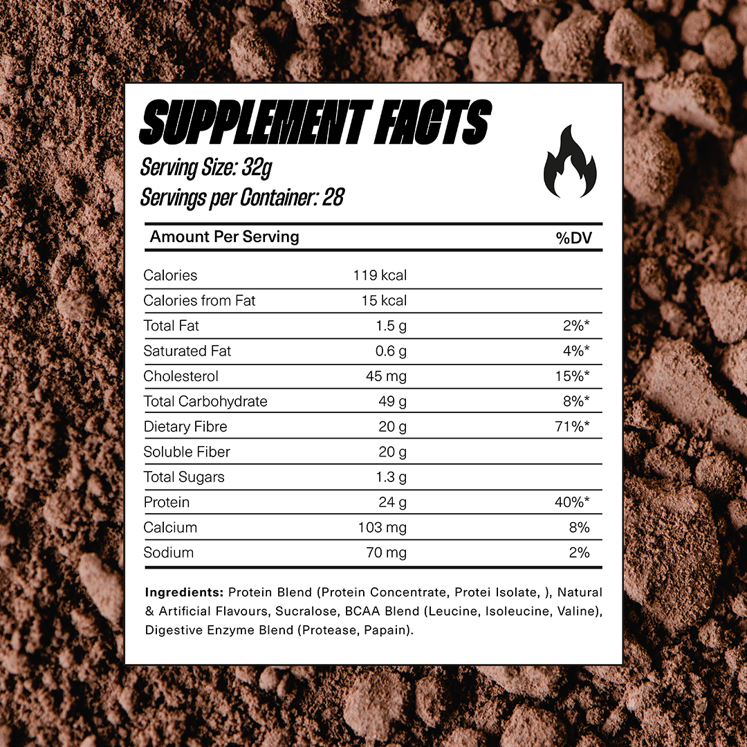
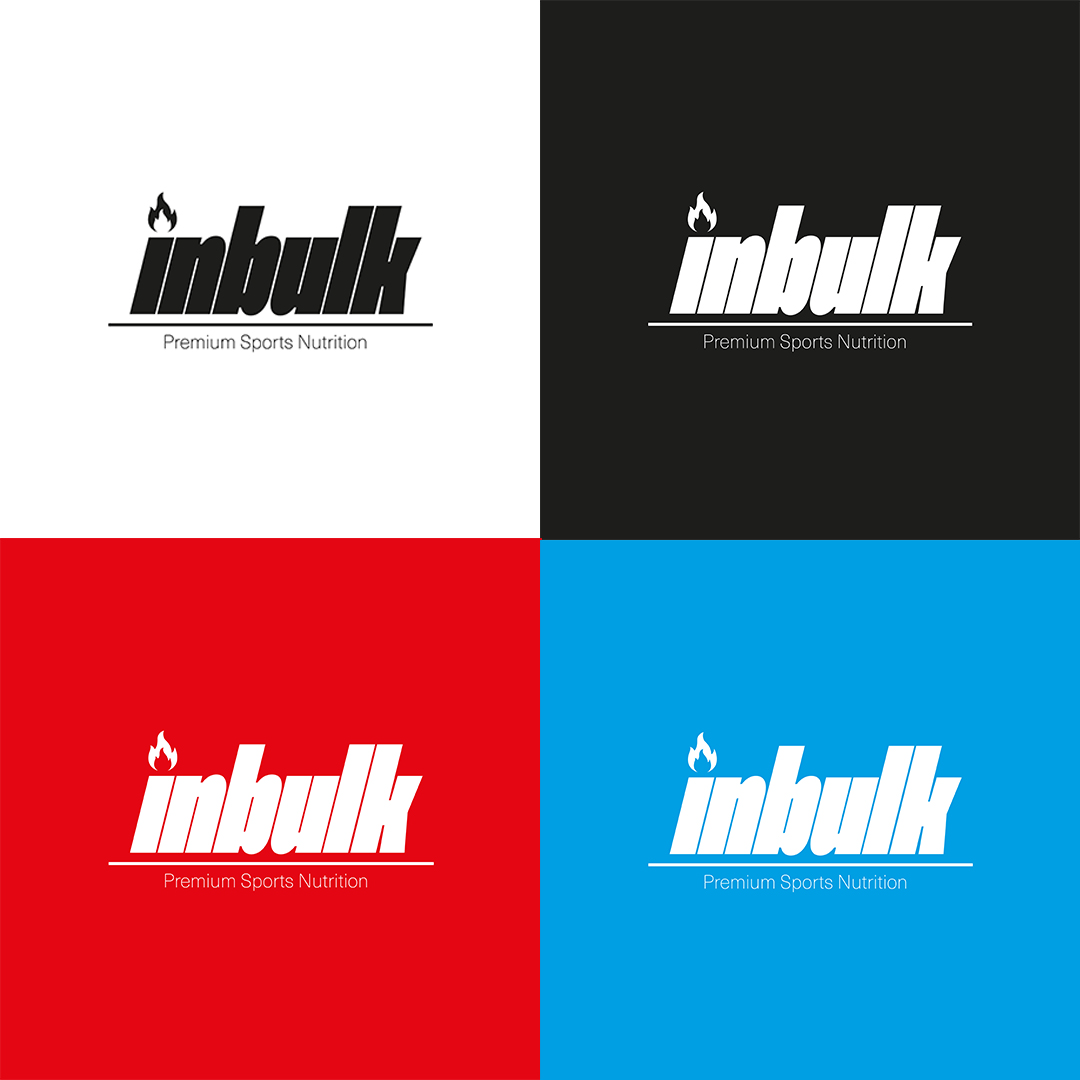
INBULK PREMIUM NUTRITION
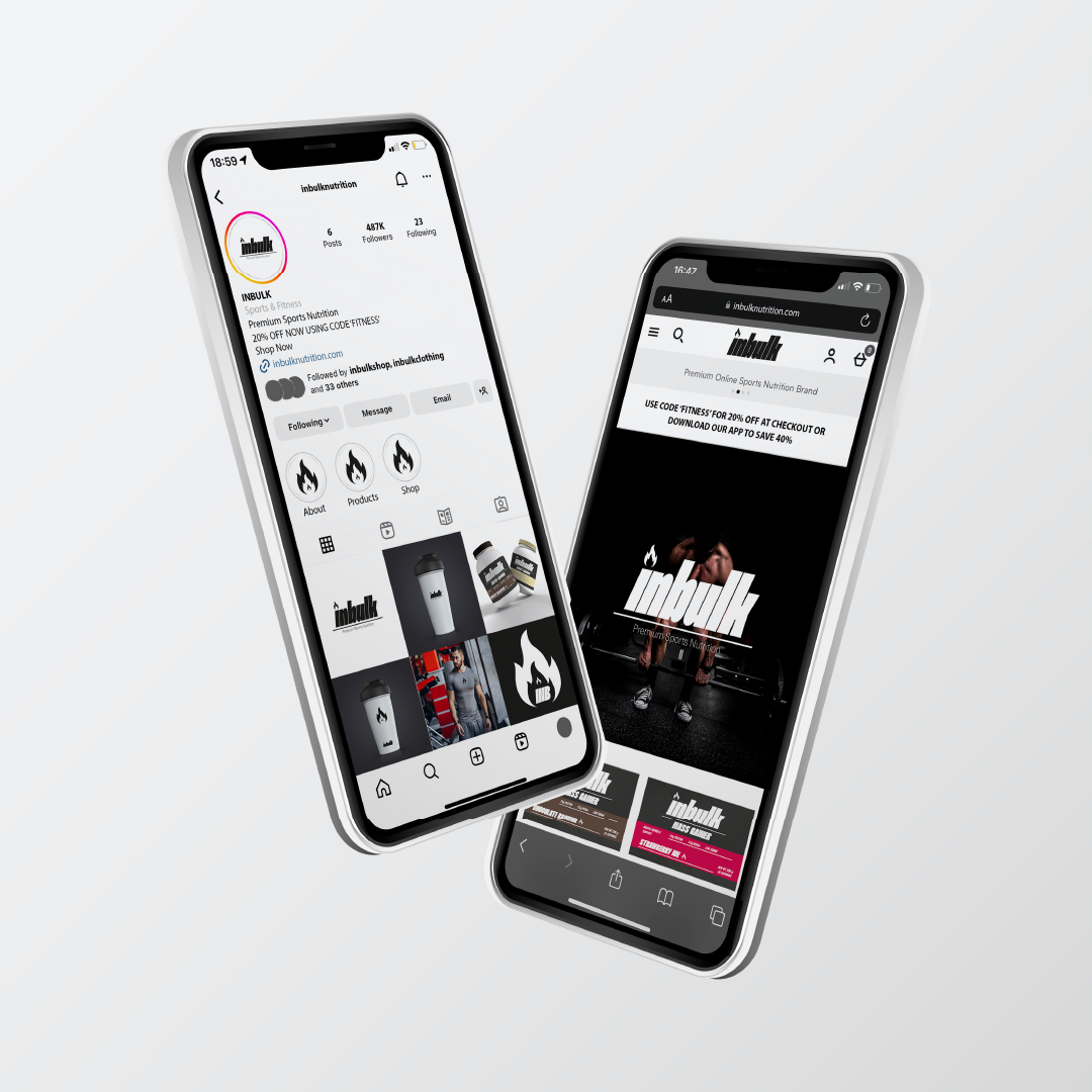
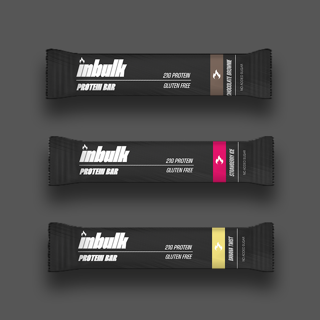
This is one of my favourite personal projects that I've ever done! I found this brief on @briefclub on instagram and I knew straight away that I wanted to get involved. The brief wanted me to create a logo and additional imagery for a protein & fitness brand called InBulk. After doing lots of research into the fitness industry, I got started!
I was so happy with the results and was very impressed with myself. I was quite new to branding and logo design so I'm confident this helped me develop those skills. I went a bit overboard with the additional imagery but I still kept the quality throughout. I hope you enjoy flipping through!

I wanted to focus on the brand being about drive and having that spark to keep pushing through the pain. I wanted the brand to embody strength and determination. I saw a lot of example material use lightning bolts but I thought that was too obvious and literal so I went the opposite way and used the idea of having that 'fire'. This lead to the use of a flame as the main symbol for the brand.