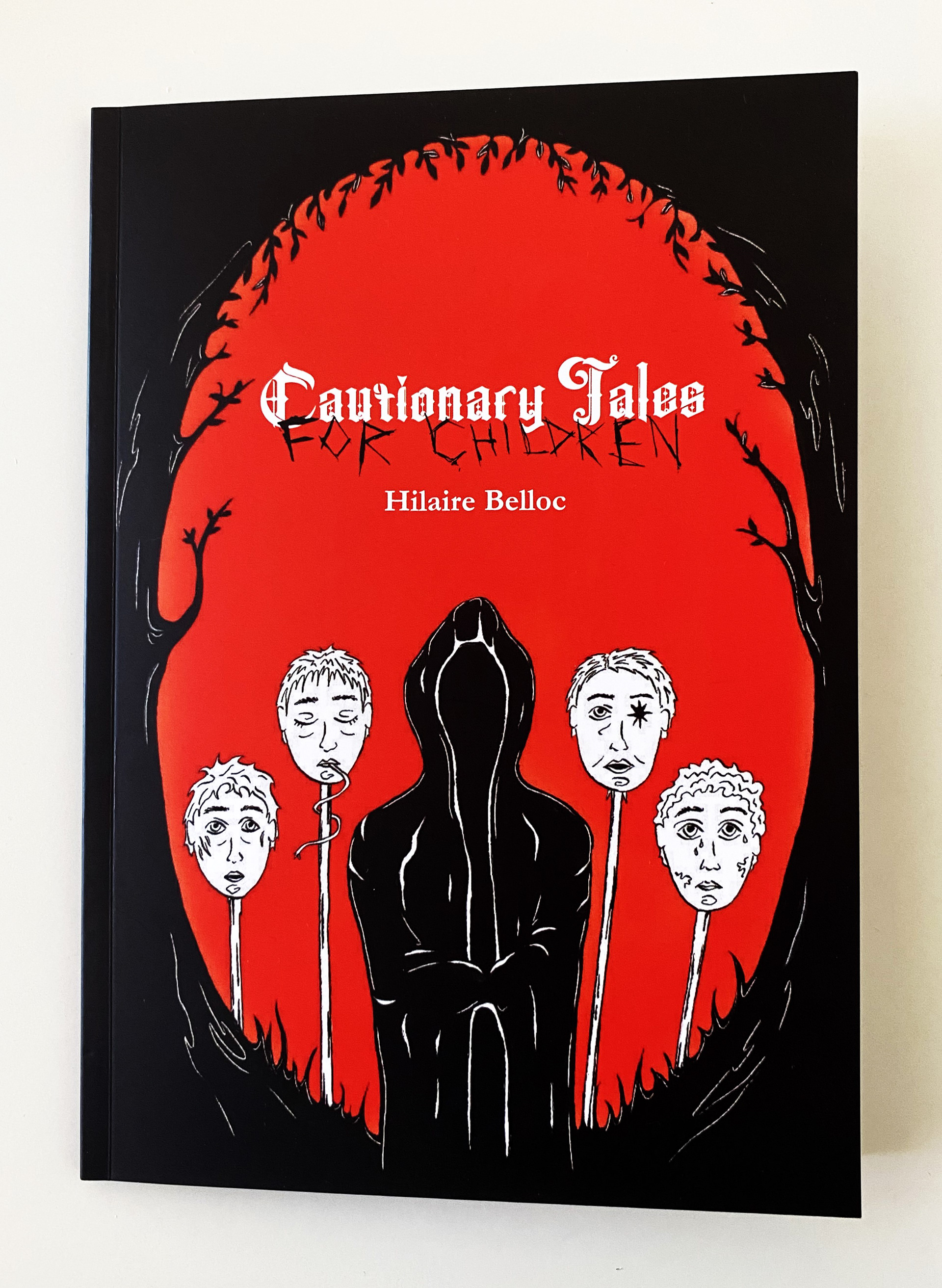
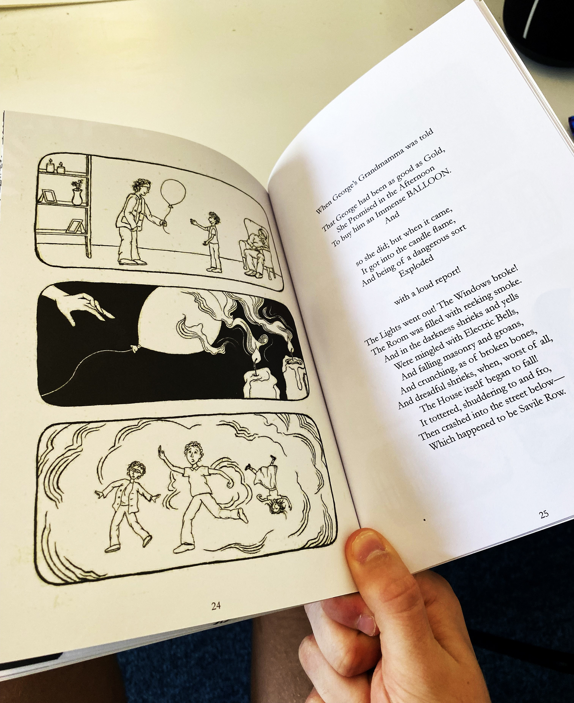
CAUTIONARY TALES FOR CHILDREN
During my second year at Loughborough University, I was briefed to design an interpretation of Hilaire Belloc’s ‘Cautionary Tales for Children’. This interpretation was to be suitable for an adult audience. The poems were famously illustrated in their original edition however I was briefed to design the poems with new and improved imagery.
This was a group project in which I worked with 3 other designers, working together on this book design. This project was so awesome to work on as it gave me a chance to work on something so different to my other work. In this group, I took up the role of laying out the book including deciding margins, grids and positioning. I also took up the role as Art Director for this project, which was so interesting as it was my first piece of leadership experience in a design environment which definitely helped my skills as a designer and as a leader.
We were all really happy with the result of this design and upon submission, our tutors and markers were also very impressed with this project. I hope you enjoy flipping through!
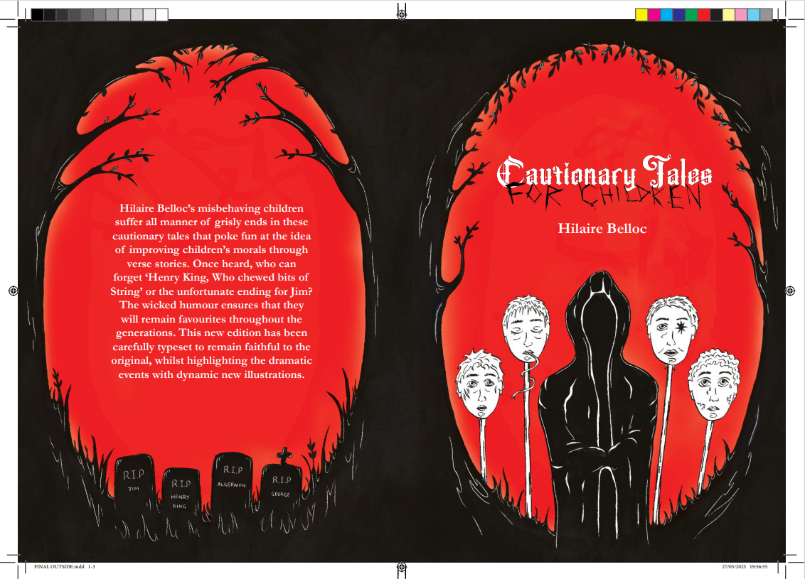
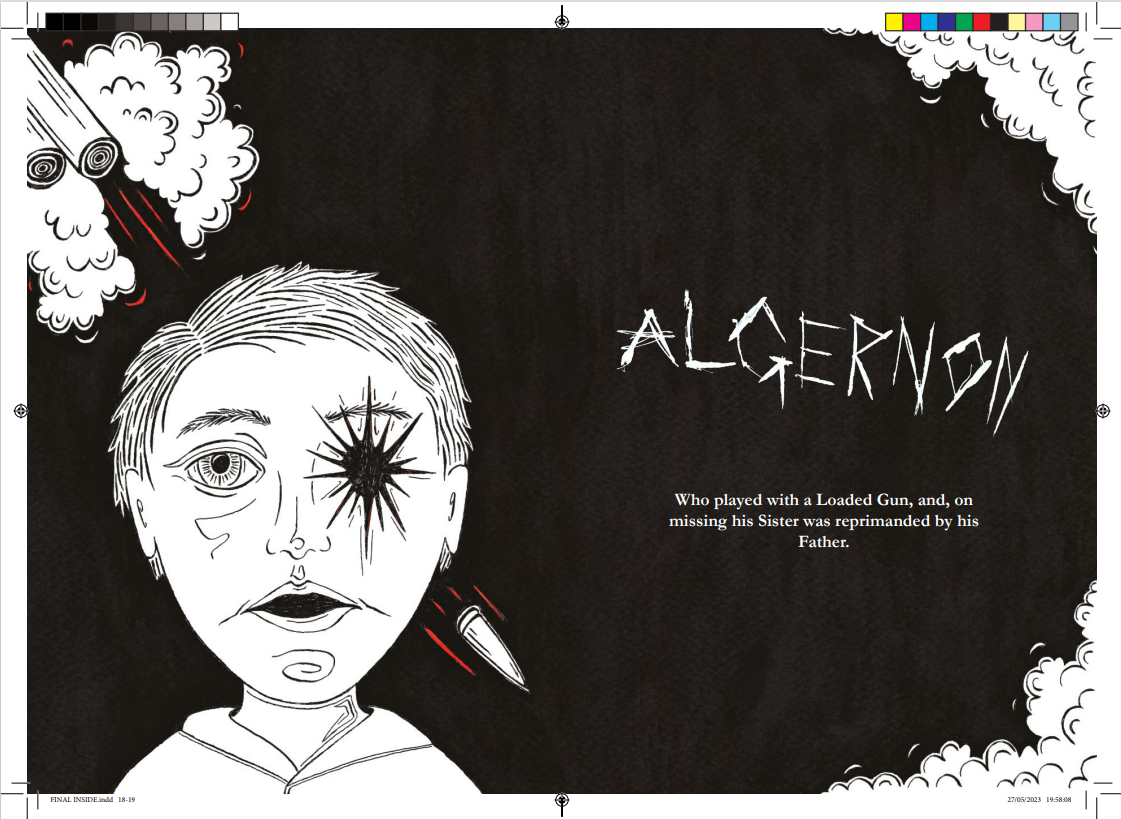
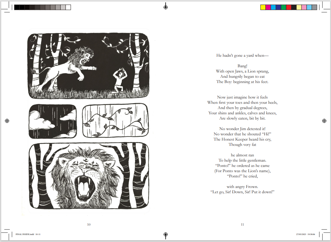
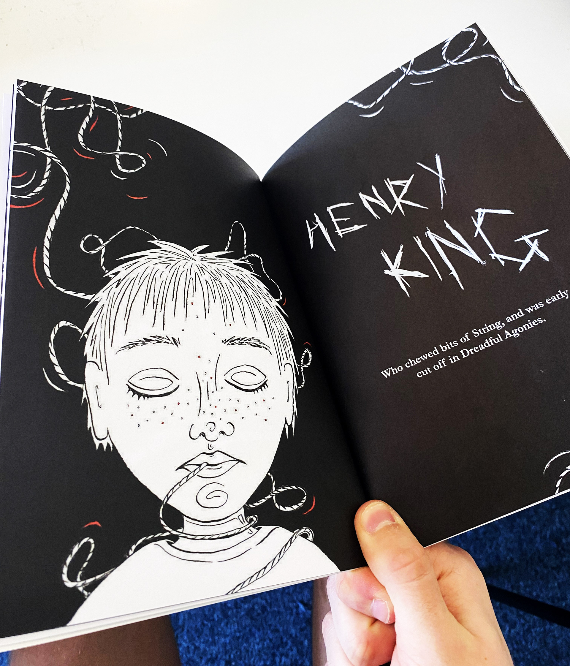
As we were designing for an adult audience, we wanted to go down the horror genre route which meant making these illustrations really vivid and brutal. this allowed the book to be not suitable for children which achieves our target audience. We implemented a limited colour palette to have a more intense series of illustrations, focusing on dramatising the imagery to reflect the horror genre.
Upon completion, I also took it upon myself to have the book printed. This was a new experience for me as organising the printing was a lot of fun. I also thought it would be useful to have a physical piece of work in my portfolio to showcase a range of mediums.


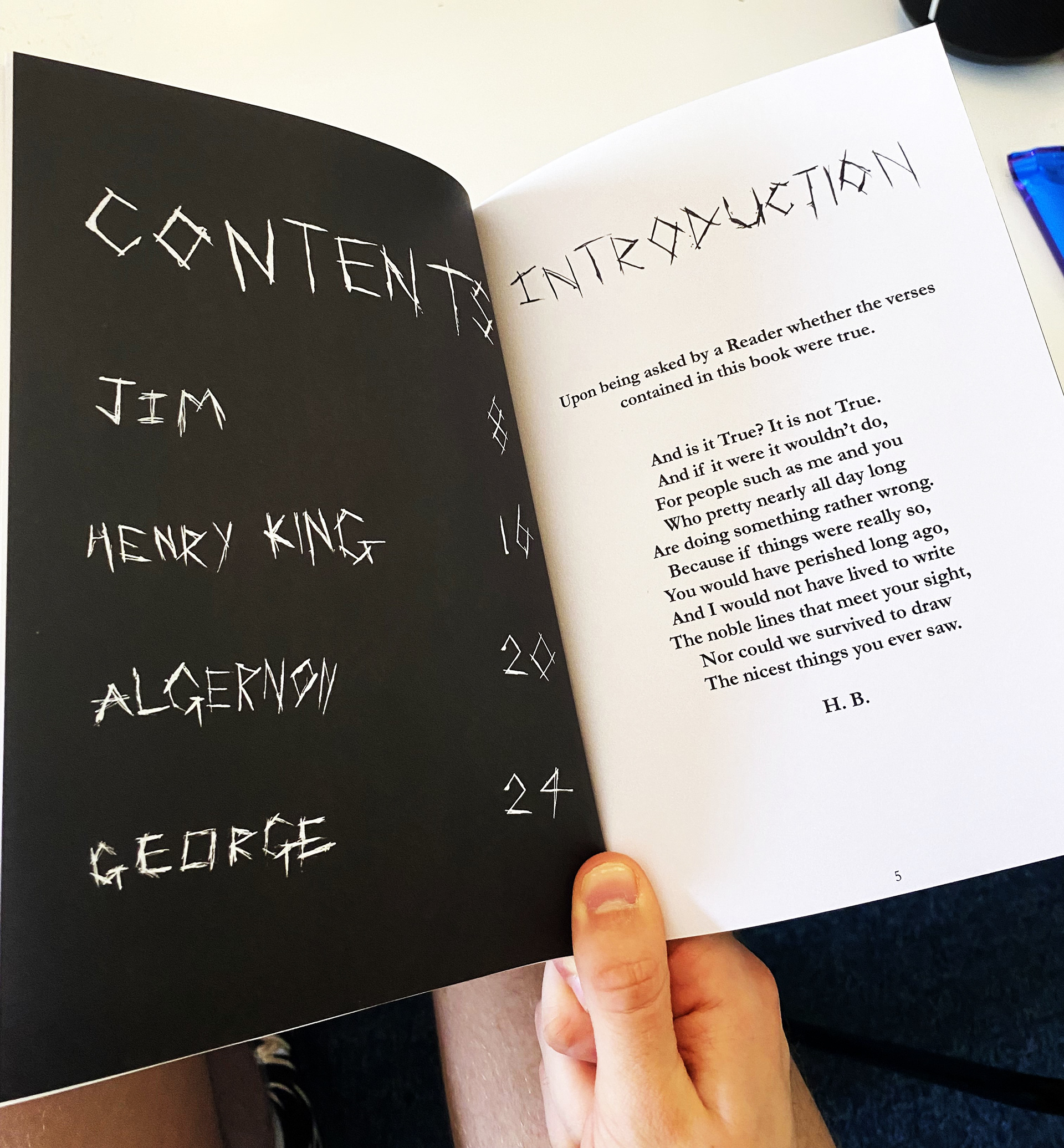
GROUP DETAILS
Art Director & Layouts: Joseph Land
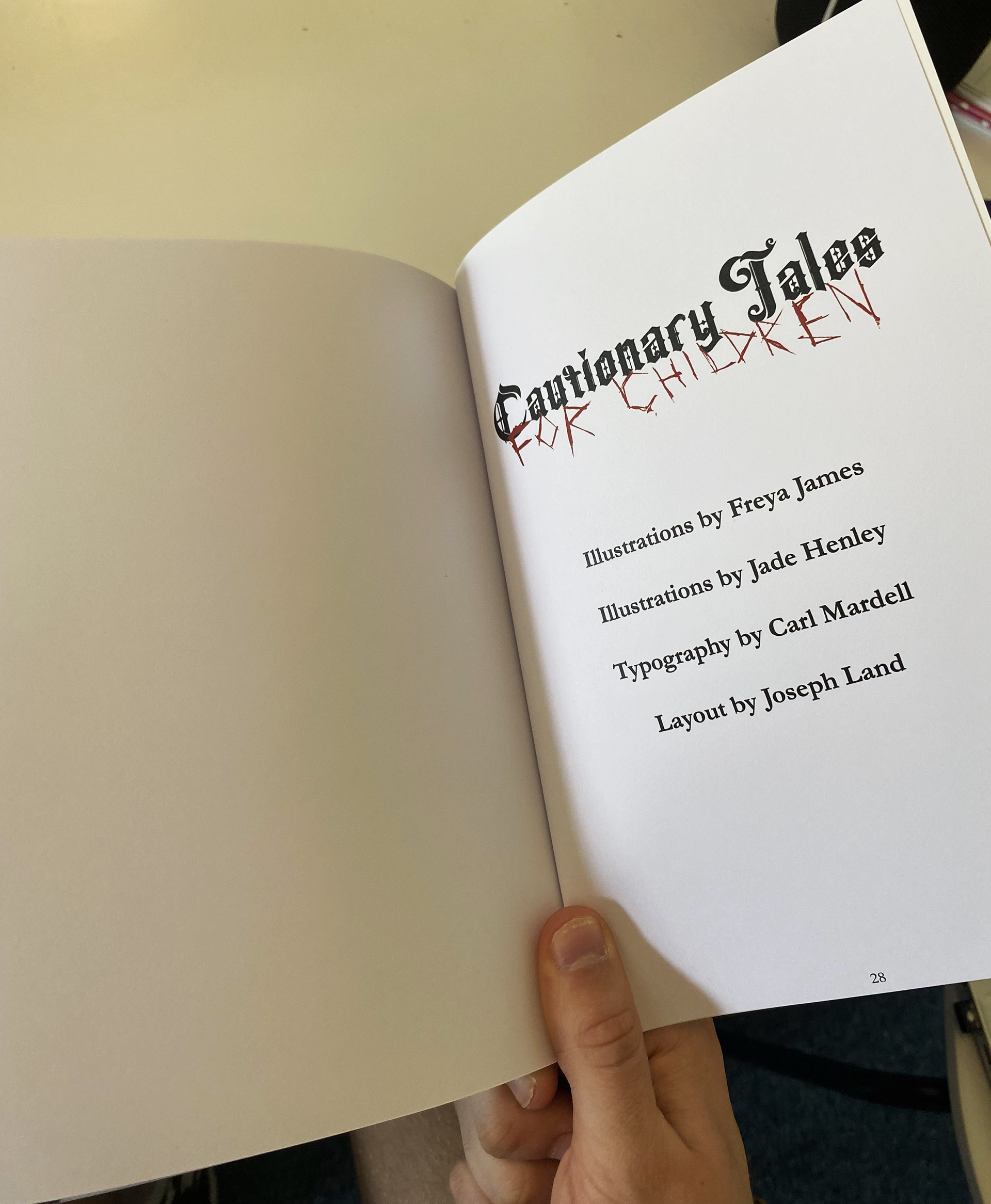
Front Cover & Cover Page Illustrations: Freya James
Story Illustrations: Jade Henley
Typography: Carl Mardell